CamperLab Enhances Its Independent Essence with a New Visual Identity Ahead of Its Paris Fashion Week Debut
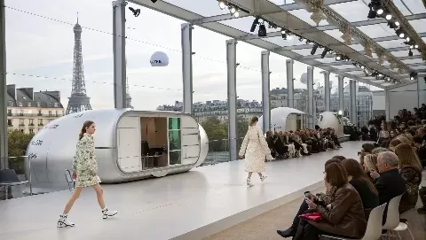
Madrid— CamperLab is making a new statement for itself with a different identity from its Spanish shoe mother brand, Camper. It thus foresees that CamperLab will stage a huge show at Paris Men's Fashion Week.
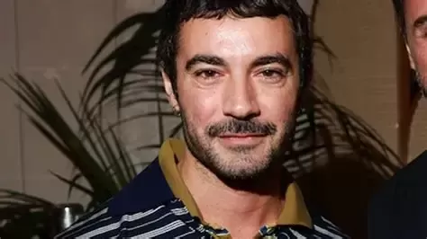
The team at Camper had been carefully cultivating Camperlab, once declared as the boldest line of the house. Things went fast until February 2024, with the launch of the first clothes series of CamperLab, designed by Achilles Ion Gabriel, who has been the chief creative head of Camper since 2020.
Once Romain Kremer departed, it was Achilles Ion Gabriel who came in as the creative head of Camperlab, and from August 2020, Gabriel became global creative director of Camper, wherein he was responsible for all lines, and Camperlab suddenly became his playground for new concepts. The development has a new logo, sign, and visual identity, keeping on the bold side but also borrowing bits and pieces from the past look. Big inspirations come from local lizards, like the Balearic lizard and viper snake, existing symbols of new beginnings and hard times.
The more refined logo stands in contrast to simple trends, with its elegant typeface featuring tooth-like ends. The sign uses two "C" shapes, envisioned as a snake's open mouth with sharp corners. CamperLab describes the new style as somehow clashing and really odd, with irregular shapes that contort and twist to form a stark and severe appearance. The logo and sign mark CamperLab's metamorphosis from plain shoemaking into a daring, solo-fashioning kind of brand. The biting and grasping alliteration that the two-'C'sign stands for shows big-time transformations.
In a nutshell, this whole new look of CamperLab's is conveying is the brand's evolution and plans to be one of the leading names in the world of counterculture fashion and lifestyle.